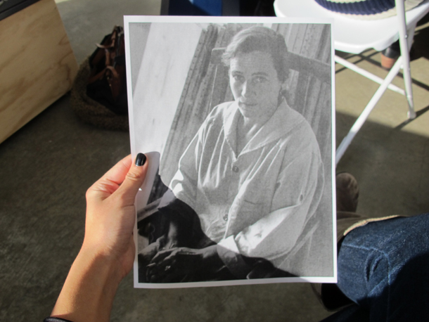
Matt Giel was the first artist I met after moving to Philadelphia three years ago—his MFA show at the Crane Building was beautiful, so I picked up his postcard and gave him a call. I curated his work in the exhibition “Duett” at Grizzly Grizzly in 2012, he rescued a roving squirrel from my apartment a little later, and now we’re friends who share a CSA. Matt’s expanded photographic practice encompasses analog image making, painting, performance, installation, and participation. He also works as an exhibition photographer and preparator.Becky Huff Hunter: I want to know more about this piece…Matt Giel: That was kind of a performative print. I learned a while ago that citric acid can affect the emulsion of photo paper. One day I was eating pho, squeezing lime into the soup—it was actually just before my darkroom printing performance at the Crane Building—and where my fingers touched the print it left these areas, white rings with yellow and green because of the lime residue. I wanted to incorporate this into a photograph. So, here, I’m peeling and eating an orange during the exposure of this cloud photograph.BHH: This is my first time in a darkroom since art school. When in the development process did you eat the orange?MG: With the orange piece, first I ate an orange and timed roughly how long that takes—about 90 seconds—then I made sure that the settings for the print would take 90 seconds to expose, and in the darkroom while eating, let the peel and juice from the orange get all over the print during the exposure. I have to wait until my chemical bath is pretty much exhausted—almost out of date—before I experiment with ingredients like this. Getting orange juice in the chemistry isn’t good for it.BHH:So few people work with analog photography anymore and darkrooms are dying out. What keeps you interested in the medium? Does scarcity have something to do with it?MG: I’m attracted to the tangibility of film and paper, its material qualities. The darkroom has always been my favorite aspect of photography—more than operating a camera and much more than editing on the computer—it’s central to my practice. It’s gratifying to make a print after fussing around in darkness, anxious that all of the settings and everything are correct. Digital is immediate; film makes me pause and think while I’m working with it.With the experimental darkroom-based pieces I’m exploring the margins of a nearly defunct mode of image-making (RA-4, color darkroom). Photography as a discipline has consistently changed and evolved in terms of production, from Daguerreotypes to commercially manufactured film and photo labs, to digital—and everything in between. For most people, the realization of the image is secondary to the image itself; I suppose I’m the opposite. My images are purposefully mundane; the “object-ness” of the print is what counts.To answer the scarcity question: it probably does have something to do with it. I’ve always been a contrarian—it’s boring if everyone is doing it.BHH: The orange peel print is a lovely example of your performative photographic work. When did you introduce this performative aspect?MG: In 2004, the last year of my BFA in Akron, OH, I was making photograms and other camera-less photographs. I began incorporating my body into the photogram. For the first consciously performative piece, I jumped up and down in front of a nine-foot expanse of paper during exposure. Using the body in a photogram seems to be a common conclusion for many artists. During graduate school at the University of Delaware I revisited this—and added getting naked to the equation. I don’t know if it translated, but I found humor in the idea that I would set things up for the print, turn off all of the lights, and disrobe before exposing the print.BHH: There’s a pun in there: exposing oneself during the exposure! I get the sense that you’re performing during this studio visit, as well as when you’re on your own in the dark room.MG: Making work in the darkroom is a very active thing, much more so than using a filter in Photoshop. In a black and white darkroom you’re able to work using a dim red light and you can faintly see what you’re doing; in a color darkroom you work in total darkness because the paper is sensitive to the entire spectrum of light. Being temporarily without sight has made me calculate all of my movements in the darkroom, I think this parallels or even becomes a kind of performance art, albeit without an audience.With someone like Ana Mendieta, she did a lot of those performances by herself, or some of the Vienna Actionists were doing similar things too. My work’s not as heady and intense as theirs, though.BHH: Your truck piece was participatory. How did it come about?MG:I bought avery old opaque projector on Craigslist—I wanted its five-inch diameter lens. I began making a large-format camera with the lens, foamcore, wood, black plastic drop cloths, and lots of gaffer tape. As I worked on it, Tim Belknap and Ryan McCartney invited me into the Pickup Truck Expo in the Crane’s Icebox space—truck-owning artists each made a piece incorporating their vehicle. My DIY camera used the rear window of my truck as its ground-glass; the lens and “bellows” of the camera sat in the truck bed; and to see the image you would go in the cab and look out the back window. The expo audience saw a camera obscura image when they entered my truck—the camera was functional, so I was able to take some crude group portraits.Disconnected from the truck, I eventually used this camera to shoot a skull still-life and an orange studio shot.BHH: As someone obsessed by drawing, I love the linearity of much of your work, for example the seemingly endless scroll of your 305 foot seascape, exhibited at Rowan University Gallery, and the repetitious lines of the piece which was exhibited in the Vox Populi Collection show last year. What attracts you to the line—I mean, the long stretch of paper? Is it something to do with the way it can capture time? Or the way it registers so much of your touch?MG: Making my pieces is a very active experience—often some kind of movement takes place during the paper exposure and a straight line is a motion I can maintain without being able to really see what I’m doing. Many of my works, such as the 150 and 300 foot coils of paper, focus on the horizon line found in nature. It seems logical to keep extending the horizon line. I’ve also made lots of circles, as that motion similarly translates to print.I’m compelled by both time and touch. Photography boiled down is light and time: the print is a manifestation of physical touch.BH: I’ve been re-reading Roland Barthes’s Mythologies and was struck by one sentence: “Plastic remains impregnated throughout with this wonder: it is less a thing than a trace of a movement.” I’ve been staring at all my plastic objects ever since—curvy shower gel and shampoo containers, for example—thinking of them as a sort of fossilized flow. And now I’m looking at the piece of yours I have in my apartment: it’s alive with movement! You might say that your performative photographs are also not so much images as traces of movement, or even performance documents?MG: It is my intention to convey a sense that something beyond the traditional making of a photograph is happening in the production of my work. I don’t expect a viewer to fully understand what that action may be, especially as people are more and more removed from film photography. That’s okay, though. I don’t think you need to be able to make a piece of art to appreciate art.
Author: Bea Huff Hunter
-
Jane Irish’s painterly protest
The title of Jane Irish’s most recent solo exhibition, “A Rapid Whirling on the Heel,” adapted a phrase from Edgar Allan Poe’s epic 1848 prose-poem “Eureka.” Poe’s text unfurls a cosmology that anticipated the “big crunch” theory of an infinitely collapsing and expanding universe. Mobile conceptions of time and location, the likes of which undergird modern cosmic physics, similarly permeate Irish’s decade-long painterly inquiry into the histories of Western imperialism and resistance knotted around the Vietnam War. The exhibition comprised fifteen framed egg-tempera paintings, ink drawings, and preparatory studies, each ostensibly depicting ornate European period rooms and Vietnamese heritage sites, and a large-scale triptych, Cosmos (all works cited, 2015), which was suspended theatrically from the gallery’s high ceiling. Each work takes anachronism as the structuring device for its depictions of dreamily warped interiors. The tempera-on-linen Malouiniere Chipaudiere with Figurehead presents a Breton colonial-era foyer and dining room, decorated with warm-toned Louis XV furniture and a wall-mounted slave-ship figurehead surrounded by chinoiserie paneling and trompe l’oeil wallpaper. Yet these wall decorations and panels bear 1960s and ’70s antiwar iconography—veterans’ helmets, daisies, discarded medals—juxtaposed with idyllic scenes of pre-French-occupation Vietnamese pastoral and spiritual life, all rendered in camouflage hues of forest green and golden brown. By interlocking these three cultural moments, Irish boldly marks similarities between the US assault on Vietnam and the eighteenth- and nineteenth-century imperialist invasions of Southeast Asia and beyond.
While traveling in Hanoi Province in 2008 and ’10, Irish studied the archaic Vietnamese Nom alphabet and pictograms from motifs on ancient ceramics, whose gestural shapes she would later incorporate into her work. As with cursive script, these forms articulate the movement of the hand across the grounds of Irish’s paintings. In the gouache Malouiniere Launay Ravilly Reception Study, loosely calligraphic marks perform a kind of visual shorthand for objects in an eighteenth-century chateau. A plump burgundy “figure eight” sprouting spindly curves indicates a chair; a quickly brushed blue circle amid a stack of horizontals signifies a carved mantel; human figures are zigzag tangles with inky trailing limbs. The swift, straggly action of the brush lends this interior a malleable, ephemeral quality: A maroon chair bleeds into a maroon rug; stalactite-like drips imply dereliction. It is as if all the painted lines, static for now, might at any moment reanimate their wriggling movement and destroy the room’s fragile integrity. The more fully worked—but no less visually active—Malouiniere Launay Ravilly Reception hung immediately to the left of the gouache study. Ghostly images of protest and pasture drift on this room’s pale ceiling, sketched in electric magenta and in some places inverted as if revealed via camera obscura. Protesters’ signs read gold star mothers, in reference to a service organization for mothers of fallen soldiers, the text rendered as fluidly as the figures. This “resistance ceiling,” as Irish calls it, appeared in several exhibited works, replacing traditional decorative painting mythologies of warring gods with images of mourning. These people, objects, signs, and army-green panels slip, move, and recur throughout Irish’s oeuvre, inscribing a painful loop of trauma.
House of Tan Ky, depicting a preserved historic dwelling in Hoi An, is one of three works in the exhibition with a Vietnamese interior. While Irish’s subverted chinoiserie is again present, in place of a ceiling the dark wood interior opens out into an expanse of oceanic blue-and-green wash studded with Vietnamese zodiac and mythological signs—including a bucking horse, floating crustaceans, and monks in prayer—concisely dotted and delineated in white tempera. These pictograms evoke a shared experience of gazing in wonder at distant galaxies. The show’s linchpin, the suspended Cosmos, made in direct response to Poe’s “Eureka” and to Vietnamese cosmology, develops its theme across three hefty and densely covered tempera-on-canvas panels. Floating above the viewer, the work’s deep blues and grays, reminiscent of the palette of traditional ceramics, conjured watery heavens inhabited by dragons. Cosmos, embedded with some of the same antiwar vocabulary as the wall-mounted paintings, is a literal manifestation of the resistance ceiling. Hovering ominously overhead, the painting implicated the gallery and visitors in the difficult histories that Irish confronts, and invited viewers to seek connections between the deep impact of European colonialism and the burgeoning US imperialism that ravaged Vietnam and persists unabated to this day.
-
Nick Hughes: Naive descriptions and intricate models
In Nick Hughes’s densely worked aquatint intaglio prints, puppet or toy-like figures float in formal relation to intricately modeled furniture, tentatively moored in deep black and silver-grey surfaces. Each work on paper arranges impressions, or as Hughes puts it, “naive descriptions,” of materials that surround him in both his studio and memory: a wooden souvenir doll; an erroneous colonial-era biological sketch seen in a museum; a perspective-defying circular chair of modernist design. As lived-with objects and images become thoughts, they gain layers of meaning. Hung in collectively titled groups—“Awkward Menagerie,” “Architectural Heritage”—this diverse content comes together in conversation.
Like dramatically spotlit photographic stills—picture the performance documentation of oversized props and choreographed stances integral to Robert Wilson or Christopher Knowles’s recitations—Hughes’s prints suggest a moment captured within a broader set of movements or possibilities. Each character and item, modeled using tender line and tone, becomes part of Hughes’s tactile lexicon or alphabet of objects, reminiscent of Philip Guston’s collections of small textural still lifes that stack and queue up into rearrangeable visual sentences. The pools of darkness in each work foster mind-wandering: the impetus to imagine, connect, and narrate combinations of motifs that slip across the assembled prints.
Allusions to familiar crafts and childlike illustrations coax the dropping of one’s guard to free association—a reading of these works as depicting a Western collective unconscious, which must be uncovered, sifted, and sorted through in order to find new cultural grounding and progress.
-
Rodney McMillian: Waging an artist’s war
It has been a big year for Rodney McMillian. In a rare achievement for any artist, three major East Coast institutions mounted simultaneous solo exhibitions of his multimedia works, spanning more than a decade. At the Studio Museum in Harlem, the Institute of Contemporary Art (ICA) in Philadelphia, and MoMA PS1 in New York, McMillian’s shows laid bare the complexities of racial violence and injustice in the United States. As McMillian told Artforum, the exhibitions presented “different modes of engagement within my practice” across forms, conceptual strategies, and themes—including the class-based politics of domesticity, the liberating construction of identity in science fiction, and the bloodied history of the American landscape.[1]
In conversation with McMillian, curator Heidi Zuckerman described his body of work as fulfilling the “intention to communicate some of the complexities of things that are taken for granted if people do not ask questions.”[2] This statement parallels James Baldwin’s oft-quoted imperative, a rallying cry for creative practitioners: “The artist cannot and must not take anything for granted, but must drive to the heart of every answer and expose the question the answer hides.”[3] Baldwin was talking specifically about the hidden, oppressive social structures that artists like McMillian so thoroughly expose. Baldwin’s great hope, writing in 1962, was of the US finally “moving beyond the Old World concepts of race and class and caste.”[4] While progress has been made in the past half-century, race, class, and gender are still major social problems that demand artistic interrogation.
At the Studio Museum in Harlem, McMillian’s sculptures and wall-based works constructed from broken furniture, smashed appliances, and shoddy textiles materialized an environment of domestic distress. These ironic “Views of Main Street” served as a powerful context for video works that took direct verbal aim at problematic government policies. Together, the works in this exhibition (March 24ndash;June 26, 2016) exposed individual and community struggles hidden behind a bucolic vision of the American dream and exacerbated by national economic directives that hit poor, often African American, populations the hardest. Untitled (2011) is a huge maroon carpet crusted with trodden-in dirt and cut into the shape of a floor plan, probably of a low-income studio apartment. A long rip in the fabric has been sewn up. It smells dank, indicating its origins in a neglected building, and its patterns of wear map out the ghosts of its former home. A single clean rectangle preserves its velvety pile, perhaps protected at one time by a corner couch or refrigerator; the worn pathway is an index of limited human movement. Reoriented onto the wall, the carpet juts out onto the floor like a welcome mat. Like a similarly scaled, cracked and peeling linoleum work (Untitled, 2006), it speaks to architectural space as social space. Though absent, this space is palpablemdash;messy, smelly, aged, and never purely theoretical or abstract.
Four works made from found seating reinforced the sense of domestic insecurity, even danger. Untitled (2009) violates a near-archetypal piece of middle-class furniture: a birch-framed, beige-upholstered Ikea Poäng armchair. A slickly painted, rough, black column penetrates the seat of the chair, leaving a dark stain reminiscent of forensic evidence surrounding a wound. While the column is made from cardboard, it looks heavy and irremovable. The absence of a seated person brings to mind a near-miss. This work is often read as representing sexualized violence, but the tableau feels somber in its stillness; the scene is inert and unmovable, perhaps capturing the sense of inevitable defeat wrought by poverty. Though McMillian appropriated his own Ikea chair for this work and often uses his body in performances, he does not intend a personal expression or claim autobiographical significance. “These works have nothing to do with my life, but they have to do with certain ideas within culture that relate to the body,” he explains. “It’s about the idea I’m trying to communicate. Once I understand or decide what it is I intend to say, I then seek out a way to say it. So, one approach is to think through the idea from the perspective of different material possibilities, questioning which one enables the idea to be the most apparent. I’m usually not too concerned with trying to master a technique…I’m usually just happy I have an idea and a plan of action. Once I have that, it’s about the physical work, the labor, and staying focused on the why.”[5]
“The Black Show” at the ICA (February 3–August 14, 2016) featured textile and paper sculptures, as well as videos in which McMillian performs, all revolving around science fiction as a means to reconstruct identity. A massive black, white, burnt orange, and blue-painted paper curtain snaked diagonally through the gallery’s main space, suspended from the high ceiling through shiny, domestic-looking eyelets stitched into a stiff black vinyl hem. Layers upon layers of ink, acrylic, and latex paint created the startling impression of a forest of flailing limbs, or the fleshy insides of a body, lit suddenly by a camera flash. (In contrast, the reverse side is matte black.) A monumental, yet brittle intervention, Many moons (2015) dwarfed visitors and choreographed a curving pathway around McMillian’s videos, wall-based sculptures, and textiles. He describes the effect of the work as “being inside and outside; being an image while also creating a darkened space for a video; perhaps delineating the space into night and day…I think it provides multiple ways of moving through, viewing, or grasping the exhibition.” Discussing a similar work, Representation of a Landscape as a Wall (2012), he explains, “I wanted to shrink the space, to make a painting that was as much about a viewer’s physical presence in front of it as it was about looking…[Many moons] was made with similar concerns, so it’s about architecture as much as it’s about painting and sculpture.” In contrast to the critical perspective on urban housing in “Views of Main Street,” “The Black Show” treated architectural space as something malleable in ways both hopeful and sinister. These varied bodies of work installed in different cities and institutions remained in constant conversation. As McMillian explained to me, “It’s a matter of location. If we’re in Central Time, Pacific Time, or Eastern Time, right now we’re in different time zones but we’re talking at the same time.”
Sculptural form played a major role in “The Black Show,” from the monumental curtain to the large- and smaller-scale, wall-mounted works in stitched black vinyl and latex paint that animated the space. McMillian used the entire gallery from top to bottom, turning the exhibition into an essayistic constellation of works. Untitled (lungs) (2008–13) and Untitled (target) (2012), two textile sculptures hanging diagonally opposite each other, brought the violence and systemic racism condemned by the Black Lives Matter movement into full view. The half-collapsed, blackened lungs molded in painfully angular chicken wire and fabric viscerally recall the last words of African American father Eric Garner as he was held in an NYPD chokehold: “I can’t breathe” became a mantra of national protest at peaceful rallies and on social media.
6 At the time of McMillian’s Studio Museum exhibition, one of the museum’s windows bore an “I can’t breathe” sign to signal community solidarity. McMillian’s black vinyl target used art historical references—Eva Hesse’s bodily abstractions of circular and dangling parts such as Vertiginous Detour and Jasper Johns’s now-canonical Target with Four Faces (1955), a painted representation of a shooting range target with cast faces mounted above—to draw attention to the act of looking as an act of violence. In today’s surveillance culture, which affects nonwhites the most, we are all familiar with this condition. Installed high on the wall (close to the ceiling), Untitled (target) cast an ominous presence, like a security camera looking down on gallery visitors and the vulnerable lungs alike, its form a reminder of the consequences of being seen, of being a target. Such strategic placement of works reinforced the sense that viewers were, even if only momentarily, inducted into a very specific, and traumatic, lived state. The museum’s security cameras and alarms took on a hyper-visible aspect as the viewer became alert to this pervasive system of watching. As McMillian explains: “Since the time I could walk and talk, I have been aware that every time I leave my house, I can be misidentified and end up with a State-sanctioned bullet to the head…There is no way to represent trauma. I have no interest in trying to. I’m more interested in presenting a representation of our lived state that includes trauma.”7
Wild Seed and Wizard (for Doro) (both 2013), which take their themes from science fiction, also address bodily trauma. While much mainstream science fiction has been criticized recently for its straight, white, male-centric attitude, McMillian draws on the literary dark fantasies of Octavia Butler to feed his vision: “These works were inspired by Octavia Butler’s Seed to Harvest, from her Patternist series [of novels]. Butler’s work is a challenge to hegemonic structures, among other things.” Wizard (for Doro) consists of a black vinyl hooded costume with a sadomasochistic feel, hung on the wall as if left behind in a dungeon; like a remnant from a performance, it resembles a skin that might have been shed and reanimated. Wild Seed is an expectant, bulbous outgrowth stitched in vinyl. The psychic African protagonist of the Patternist books, Doro can steal others’ bodies in an alternative world, where the body is something that can be slipped in and out of, violently controlled. Butler’s novels circulate around a persistent set of questions about whether and when people are really free.8
The phallic Column (2015) at ICA, which covers the gallery’s central load-bearing pillar in a black vinyl skin, slips a new “body” over an institutional marker. This gesture, which reflects sci-fi’s renegade creation of new ways of being, appears as an attempt to change the institution itself. McMillian has explained the attraction of such a strategy: “While reading Wild Seed, I was drawn to the transformative abilities of characters such as Anyanwu as well as Doro with his skin-snatching powers. They are able to move through, out of, into, or to a something or a someplace through their bodies and the bodies of others. The orifices, tubular forms, and cavities I’ve employed in my work are portals, sites of transformation, confounding Euro-ethnic patriarchal stereotyping of Black bodies.”9
The exhibition “Landscape Paintings” at MoMA PS1 (April 3–August 28, 2016) captured these desires and frustrations through tightly limited materials: 12 used, queen-size bed sheets purchased from thrift stores—many with price tags still attached—combined with latex, acrylic, and ink. Each painting builds on, drips off, and bursts from its intimate ground into a three-dimensional form that provokes visual associations with mouths and canyons, plants and comets. The rivulets and globs of blue and brown paint on Blue Sun (2014–15) appear to be in motion, like still-settling seismic layers or a shadowy eclipse-in-progress. Other works flow toward the floor or bundle up like giant knapsacks. Nailed askew to a wall, a creased, inflammably shiny, blue bedspread appears pregnant with a black reptilian lump the size of a human torso. This work, Wildseedling: it was already there (2014–15), acknowledges Butler’s writings in its title.
At the far end of this gallery at PS1, partially hidden behind a temporary wall, a monitor screened one of McMillian’s first video works, Untitled (sheet performance) (2005). The grainy, looping film opens on the artist’s head, body, and limbs obscured under a white sheet, which gently billows over his outstretched arms like theater curtains drawn closed in anticipation of a show. Slowly, the sheet undulates in response to McMillian’s movements. Soft light and shadow pick out folds in the fabric, recalling a dissonant variety of cultural and ideological tropes: classical statues, cinematic Ku Klux Klan imagery, and the fluid costumes and gauzy sets used by contemporary dancers, such as Trisha Brown. As the movement evolves into writhing, thrashing, and bending, the body finally appears trapped in a veil of whiteness. “My interests in performance sprang out of necessity,” McMillian explains. “There were things I could communicate through performance that were not possible through other mediums or forms. My understanding of the history of performance in art is that it originated out of a need for immediate political engagement. That, I’d say, has been the predominant motivating factor for my use of it in my practice. The video, Untitled (sheet performance), was shot on a Super VHS camera, which I liked because of its video quality [or] materiality. It also happened to be the only camera I had for many, many years.”Performance on video ran through all three exhibitions. Like the juxtaposition of the sheet paintings and sheet performance, in each space, the different mediums joined their voices together. In “The Black Show,” the videos were suspended in space on scrims or projected onto cavernous sections of wall, allowing visitors to walk around them, view multiple moving images at once, and hear overlapping sounds. It was almost as if we were in the long grass with McMillian as he crawls, painfully rasping the words to “Gimme Shelter” or were invited to participate in the dance with death in A Migration Tale (2014–15). At the Studio Museum, Untitled (the Great Society) I (2006) played on a small monitor installed next to a battered, anthropomorphic refrigerator seemingly shot in the “stomach” area, two worn armchairs sadly cemented together with romance novels, and small, sticky-shiny black reliefs (from the series “The Clampetts,” 2010) reminiscent of the reptilian surface of Wildseedling. The violence implied through this cluster of beaten-up domestic objects and flayed-looking skins bears witness to the so far failed dream of an inclusive Great Society. As McMillian has said of this exhibition: “I hope to question what ‘Main Street’ means. When I’ve heard that expression, I have never believed it referred to me or other African Americans, regardless of our economic station.” In the video, McMillian recites President Lyndon B. Johnson’s 1964 “Great Society” speech in a dry, reserved tone and with small accompanying facial movements and hand gestures: slightly furrowed brow, slow up and down movement of the hand. The speech thematically focuses on urban growth, education, and social improvement—that illusionary sense of domestic security denied by the works in “Views of Main Street.” Johnson’s central claim—that “The Great Society rests on abundance and liberty for all. It demands an end to poverty and racial injustice, to which we are totally committed in our time”—feels as unsatisfied today as it did half a century ago.10
James Baldwin’s essay on the creative process was published just two years before Johnson’s speech. For Baldwin, the price of progress is “a long look backward when we came and an unflinching assessment of the record…the war of an artist with his society is a lover’s war, and he does, at his best, what lovers do, which is to reveal the beloved to himself and, with that revelation, to make freedom real.”11 McMillian certainly does not flinch at the past or the future. Through carefully chosen materials and means, he reveals the ways in which freedom is still not real for many American citizens—and declines to offer tidy solutions.
Notes
1 Alex Fialho, “Artforum 500 Words: Rodney McMillian,” May 4, 2016, .
2 Heidi Zimmerman, “Painting the Domestic,” in Rodney McMillian: Landscape Paintings, exhibition catalogue, p. 27, (Aspen: Aspen Art Press, 2015).
3 James Baldwin, “The Creative Process,” in Creative America (New York, Ridge Press, 1962), pp. 17–19.
4 Ibid.
5 All quotes unless otherwise noted are from a phone interview and e-mail exchange between Rodney McMillian and Becky Huff Hunter, June–July 2016.
6 See and .
7 Rodney McMillian, “Wildseedling: there are veins in these lands,” in Landscape Paintings, op. cit., p. 110.
8 Thanks to Dr. Marika Rose, postdoctoral fellow at Durham University, U.K., for an illuminating conversation about Octavia Butler’s Patternist series of novels.
9 Rodney McMillian, “Wildseedling: there are veins in these lands,” op. cit., p. 106.
10 The text of the speech is available at
11 James Baldwin, “The Creative Process,” op. cit. -
Douglas Witmer’s simplicity
It is timely that Douglas Witmer’s solo exhibition, “Dubh Glas” at Tiger Strikes Asteroid (TSA) in Philadelphia, opened shortly after the Guggenheim’s Agnes Martin retrospective closed to the public. Witmer’s group of ten softly geometric, gesso and acrylic paintings on canvas are reminiscent in atmosphere and texture of Martin’s darker works, made in the mid-2000s, in which rough washes of greys and tempered blacks soaked into her large square canvases, subtly distorting their stretched surfaces. Hung nearest to TSA’s entrance, the visible sections of black gesso in the lead-hued In Plain Sight (Hiding) (2017) seem to absorb the light that streams through the window opposite.
In a 2012 interview with Libby Rosof on the artblog website, Witmer observed that growing up in the farmland of Lancaster, Pennsylvania, imbued his practice with a sense of slowness and an awareness of doubt:
That’s a tendency in my art work, not a mission. My work is intuitive. But it does come from my background and those values. Artists who come from a Mennonite background are conflicted. It’s a tradition that does not value visual arts. The culture is pragmatic. What does a painting do? … I’m a secular Mennonite. The idea of simplicity, the idea of humility, those are things I find meaningful, and I put them in my work.
In this way, Witmer’s paintings share affinities with the modest scale and materiality of the late, celebrated Philadelphia artist Bill Walton’s body of work, whose sensitive use of paint, gesso, charcoal, and graphite draws attention to the subtleties of humble materials, such as cut newsprint, folded paper towels, and frayed squares of cotton tacked to gallery walls. Each work in Witmer’s austere Winterbrook (2015‒17) series of six small panels brings out a different relational quality between paint and canvas: black wash opens up the flawed pores of the canvas grain; dense, dry paint marks the presence of the wooden stretcher as in a rubbing; carefully applied, grey and white thinly glazed layers make another panel’s surface appear taut and tremulous like drumskin.
As Witmer’s spare collection of non-images questioningly explore paint’s potential, they also conjure associations with photography and digital culture. I Alone (2017), a portrait-oriented canvas in which an opaque black square hovers over grey wash, resembles a undeveloped polaroid or a blank computer screen. Shake the polaroid or switch on the monitor, and perhaps an image will emerge.
-
“Quicktime,” Rosenwald-Wolf Gallery, University of the Arts, Philadelphia (Two Coats of Paint)
In his influential Art in America article “Provisional Painting” (2009), critic Raphael Rubinstein traced a history—from Joan Miró to Mary Heilmann—of “works that look casual, dashed-off, tentative, unfinished or self-cancelling,” that “constantly risk inconsequence or collapse.” In Rubinstein’s analysis, this attitude provides an easier yoke for artists tired of laboring under modern painting’s grand and burdensome history. Readers of this blog will also be familiar with parallel discussions of Casualist painting, a contemporary tendency to integrate the form’s traditionalism with improvisation, the off-kilter, and the seemingly offhand. “Quicktime,” a concise group exhibition at the Rosenwald-Wolf Gallery of the University of the Arts, Philadelphia, adds to this expansive conversation with a focus on painterly speed, spontaneity, and time span.
In the show, twelve recent, mostly large-scale, conventionally stretched works share fast-looking brush strokes; few visible layers of oil or acrylic; a graphic, flat appearance that emphasizes surface; and the impression—confirmed in the curatorial statement—that these paintings did not take long to make.
Amy Feldman’s acrylic-on-canvas paintings, Mars Arms and Sooty Sweat (both 2016), are daringly spare. They look as if Feldman toted a spray gun to achieve the flat grey grounds’ uniform sheen and then, narrow brush in hand, repeatedly raised and lowered her arm to create simple chains of curvy shapes. Marina Adams’s similarly large scale but highly colored works flank Feldman’s in the gallery. With their glowing bright, harlequin-pattern blocks of thin wash over still-visible graphite guidelines, they appear like skeletons of—or sketches for—ambitious modernist works. Both artists works here display the qualities of what Rubinstein called “body doubles.”
Works by Patricia Treib and Melissa Meyer have a calligraphic quality, reminiscent of the writerly gestures of Louise Fishman or the pictograms of Jane Irish, though these comparative examples bear the marks of having been worked over many times. Treib’s Camera (I) (2013) is a pared-down still life of a vintage-looking brown camera complete with zoom lens and, perhaps, books and a case. This photographic subject matter reflects on another kind of speed or immediacy in image making, and one that deeply impacted the field of painting.
The works in the exhibition raise the question, for me, of what it is that we value about painting right now—where we locate meaning and value in paintings made quickly. While asserting the ascendency of speed, the “Quicktime” curatorial statement betrays an anxiety about these works being perceived as purely provisional, casual, or fast—and immediately addresses this anxiety by emphasizing the opposite, namely long-term persistence in hard-won studio practice, paraphrasing Marina Adams: “it is not actual time that is needed to make a specific work, but the accumulated years of committed studio time.”
This shifting of where and when artistic labor happens feels pertinent at a time when funding for the arts is again under threat, younger artists still feel pressured to justify their choice of paint as medium, and we all feel wary about the exploitation of various forms of creative labor. Artists feel these practical pressures just as keenly as the imposing weight of art history. Under such fraught conditions, “Quicktime” proposes a position from which it is still possible to paint.
-
Pareidolia: Shawn Thornton’s hallucinatory visions
Witch Doctors at the Eye of the Solar Epoch (2008–10) is a long, landscape-oriented oil painting on panel whose dimensions and compositional structure resemble a folded-out paper map. In urgent hues, it presents a god’s-eye view of a watery city or an entire cosmos, punctuated with networks of mystical and mathematical symbols. Curving sections of pale blue, white, and brown might be water and roadways. Yet Thornton also represents some subjects conventionally, head-on, as in his depiction of a simple, brown sailboat on blue water, which is constructed from the same blocks of color that make the map. The notations include tiny rainbows and Coptic crosses; infinity signs and directional arrows; skulls connected to spinal columns, whose geometric vertebrae look like railway tracks, rendered in brown and orange; and cartouches of ancient Egyptian hieroglyphic writing—which angels supposedly fed on parchment to spiritual seekers, Thornton said. Witch Doctors comprises multiple systems coming together and falling apart, held tentatively by invisible bonds. The modestly sized painting is worked with tens of layers of tiny, almost invisible brushstrokes. While seemingly flat at first glance, and in reproduction, the painting is actually constructed of tiny low reliefs—the slow, small brushstrokes and the shapes’ carefully-delineated borders draw the viewer’s attention to minute differences between sections.
Thornton’s colors are supersaturated and largely unmixed, taken directly from the tube. Beside his easel, he keeps a studio workbench into which is built a covered wooden tray. It contains large chunks of oil paint arranged, left to right, from cool to warm colors; each has a dried skin that he pierces to access the still wet paint inside. He works this way, he says, because his paintings take years to complete and require exactly the same vivid color palette over time. Thornton applies multiple layers of paint even on background sections, to achieve the desired color saturation and surface.
Thornton’s studio is almost as densely organized as his paintings. Finished and unfinished works on board, small square examples and wider rectangular ones, hang on the studio walls. Works in progress show that Thornton starts with large, map-like blocks of color and then gradually focuses on smaller and smaller sections of symbols. Along with his own paintings, the studio contains works by his peers that resonate with his practice aesthetically and conceptually, including an intricate paper cutout of a skull by Hunter Stabler; a semi-representational pattern print in shades of grey and black by Astrid Bowlby; and circular landscapes embroidered in tiny stitches, which resemble Van Gogh’s emotive brushstrokes, by Samantha Jorgensen, affixed to two-foot high angel figurines. Nestled amongst these works of art are toys, antiques, and esoteric objects: a transparent plastic anatomical model of skeletal, muscular, and organ structures in pink and red; an egg decorated with hagiographic motifs.
Thornton’s work recalls Jain spiritual drawings of the universe, which he shared with me. These drawings tightly condense, flatten, and systematize bird’s-eye views of earth, water, and sky, and render their stylized inhabitants as richly color-blocked, concentric circles and straight, parallel lines; they also show frontal representations of temples. Even more, Thornton’s paintings remind me of contemporary artist Jane Irish’s monumental oil and graphite depictions of traditional Vietnamese oceanic and zodiac cosmologies. Irish interrupts ancient Eastern spiritual symbology with overtly political, modern images of war, including guns, protest signs, and camouflage gear. A similarly disruptive juxtaposition of esoteric and familiar content occurs in Thornton’s work, though with different motivations. For example, he turns to mechanistic nomenclature to liken the “individual components” in his paintings to Tantric painting, in which such simple geometric arrangements as a red circle juxtaposed with a black triangle represent, say, deities receptive to human meditation. Together, he says, the tiny symbols that pattern each of his works form “a cosmos of small Tantric paintings that come together as anthropomorphic circuit boards.” This uncomfortable, alchemical bumping together of the spiritual and the scientific reveals Thornton’s driving force.
In numerous interviews, Thornton has described this body of work’s germination in traumatic medical and psychiatric experiences that persisted throughout his twenties. An undiagnosed brain tumor put pressure on his pineal gland for several years, causing blackouts, hallucinations, and terrifying sensations of unreality. The pineal gland, an endocrine structure located near the brain’s center, has been subject to metaphysical and occult speculation for hundreds of years. Madame Helena Blavatsky, whose nineteenth-century theosophical writings Thornton has read, called it the third eye of Hinduism—a mystical organ that enables spiritual seeing. The notations that populate Thornton’s paintings drew initially from his own pineal visions, which were not paranormal in nature, but pulled from his memories of cultural symbols. This exhibition’s title, “Pareidolia,” refers to one way that Thornton has grappled with the emergence of these remembered images as hallucinations. Pareidolia names the human brain’s evolutionarily expedient tendency to see patterns where none exist, for example to see faces in rock formations, wood grain, or even abstract painting.
Now, Thornton researches existent visual systems to enrich his practice. In addition to Jain and Tantric cosmologies, he is interested in medieval bestiaries, shamanic power objects, and fantastical codices by contemporary designers, including Luigi Serafini’s Codex Seraphinianus of imaginary creatures. For Thornton, these diverse iconographies are analogies for the visions he saw when ill, and for the decentered state that he still endures, rather than persuasive belief systems: “I’m sure anyone who has been sick knows this feeling of being fractured inside—you find you’re in a constant, urgent dialogue with yourself, trying to put the pieces back in order.”
Science fiction offers Thornton another byway from the straight and narrow track of empirical thought. In H. P. Lovecraft’s short story “From Beyond” (1934), an inventor who believes “strange, inaccessible worlds exist at our very elbows” stimulates his own pineal gland electronically and unveils a hitherto unknown range of human perception. As other-dimensional creatures appear, fear, chaos, and murder follow¾a reminder of our mortality, and a moral suggestion that perhaps we are better off, healthier and more content, when relying on our limited natural senses. Thornton’s Brahmastra For a New Age (UFO/Time Machine) (2010–13), is structured around a central near-ellipse—or flying saucer—marked with white, red, and green borders like planetary rings. Like Witch Doctors, this work represents its subjects in an overhead view, as in an architectural plan, and also three-dimensionally, as in an architectural elevation. This work’s title signals the danger inherent in moving beyond the known, as “Brahmastra” in ancient Sanskrit writings is a powerful weapon. In this painting, the danger is both scientific and spiritual, and made more apparent by the chaotic circuitry of connected miniature symbols that swarm the work’s surface. The combination of these digital and ancient referents, and their sheer hyperbolic quantity, produces a risk of cliché of which Thornton is aware. He told me, “I will sometimes use an image, symbol, or representation that I am aware has been overused and is a cliché, but I’ll overload it through repetition, create a synergy with surrounding images, or contradict it with seemingly diametric images from a different visual vocabulary.”
While the process of painting can be meditative for Thornton, finishing a work is not cathartic, nor does making art resolve inner conflict. It is more accurate to think of these works as having a dual purpose as containers for traumatic experience and living documents of the multifaceted research into this experience. “The paintings are both talismans and malignant forces,” he told me. A trained artist, Thornton nevertheless feels close to the early-twentieth-century abstract work of German faith healer Emma Kunz and the complex maps by Swiss outsider artist and diagnosed psychotic Adolf Wölfli, as well as the work of outsider artists in his home district of West Philadelphia. As a result of his health condition, Thornton has turned to outsider methodologies, but folded them into the context of contemporary art, which his work in turn enriches. Although he is a painter, his work has much in common with the dense digital psychedelia of post-internet art, such as Kari Altmann’s Soft Mobility (2014), which organizes thousands of small, interrelated images on screen in an infinite scroll and reminds us of the overwhelming amount of digital imagery we process daily. Inspired by ancient Indian spirituality, Francesco Clemente combines pattern, notation, and multiple points of view in paintings that also have affinities with Thornton’s.
However, by framing his body of work with the exhibition title “Pareidolia,” Thornton taps a more familiar phenomenon to which almost every viewer can relate—apprehending imagery in formless clouds—to create a bridge between his fractured experience and more ordinary, cohesive perceptions of reality. His use of multiple points of view, such as the blue and brown sailboat that emerges from the same sections of paint as the map-like composition in Witch Doctors at the Eye of the Solar Epoch, conjure this common kind of pareidolia. In inviting us to ask which content comes first, the boat or the map, he leads us toward an understanding of his own hallucinatory visions.
-
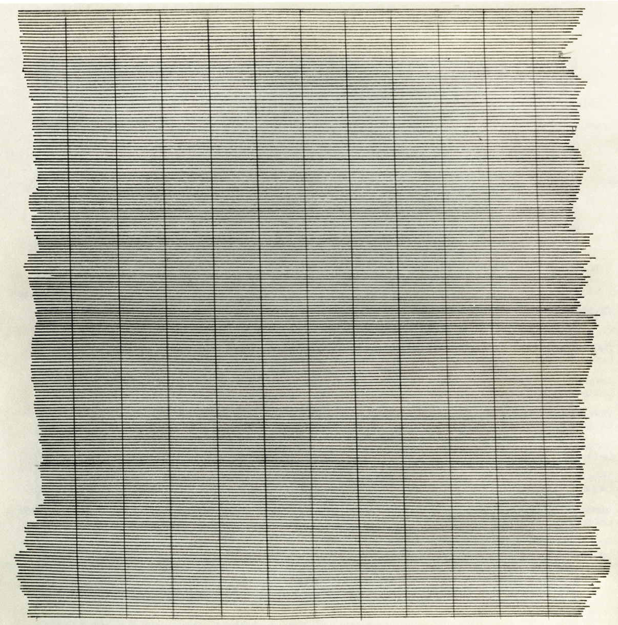
Duett: Matt Giel and Alanna Lawley (Grizzly Grizzly)
Two artists reach “across the pond” to create collaborative works based on the physical experience of the photographic image in the innovative exhibition “Duett.” Organized by art writer and curator Becky Hunter, the exhibition presents the results of a six-month transatlantic exchange between British, Berlin-based artist Alanna Lawley and Matt Giel, an American artist living in Philadelphia.
Using Skype, GChat and email to exchange images and ideas, the artists have produced photographic and mixed media work in response to each other’s practice and Grizzly Grizzly’s space. The exhibition title “Duett,” which comes from the German word for duet, reflects the two-person nature of the collaboration and Lawley’s current residence.
Both Giel and Lawley engage with photography as a swiftly changing medium with a complex history. Lawley pushes analog, medium format and found images through manual rearranging and digital processing, while Giel is concerned with darkroom details, such as the space between the photo paper and enlarger light. Their work engages with the physical properties, objecthood, and the spatiality of photography.
The exhibition will comprise three-dimensional, installed photographic work by both artists, made in Philadelphia in response to their ongoing discussions and exchanges.
Alongside the more conventional sculptural work, ephemera from Giel, Lawley and Hunter’s conversations will be on display on a dedicated web page – including edited texts and email trails, sketches, maquettes, and failed experiments. A discussion with the artists, chaired by Vox Populi member and photographer Anna Neighbor, a talk by UX designer and curator Kelani Nichole, and an essay by Becky Hunter will also supplement the exhibition.
-
Dissertation Research Travel Grant, University of York
My master’s thesis research on abstract painter Agnes Martin was supported by a travel grant from the History of Art Department, University of York. The outcomes of this grant and my thesis included an exhibition review, two conference presentations, and a roundtable discussion.
-
Research Preparation Award, Arts and Humanities Research Council
My master’s degree in the history of art was fully supported by a Research Preparation Award from the Arts and Humanities Research Council.


