Tag: philadelphia

  • “Brighter Later,” Rebekah Callaghan, Gross McCleaf, Philadelphia (Two Coats of Paint)

    “Brighter Later,” Rebekah Callaghan, Gross McCleaf, Philadelphia (Two Coats of Paint)

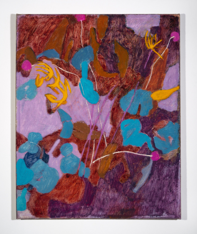
    “I think I’ve been making the same painting for a long time and it just keeps ending in a different place at a different point,” Rebekah Callaghan told painter Aubrey Levinthal in a 2015 interview in Title Magazine. The conversation focused on Callaghan’s process of working from her immediate surroundings – her home studio and the garden of potted plants that she tends there. Now, four years later, she continues to cultivate and expand upon this familiar material to make layered, luminous botanical paintings that invite sustained looking. Walking from one deft, concise painting to the next in her current exhibition “Brighter Later,” at Gross McCleaf in Philadelphia, the groupings of new works constitute a coherent series exploring variations of light, color, shape, and texture on a single theme.

    Installed in a row, the modestly sized paintings Silver Mound (2018), Sandy Bottom (2018), and Little Jewel (2019) are each built of layers of paint, many of them semi-transparent – dark brown organic blobs and black outlines under glowing lilac glaze, for instance. This creates the impression of an ever-shifting surface, mimicking the natural play of light and shadow on a windowsill or the subtle movement of foliage over the course of a day. A limited oil palette of highly saturated blues, purples, reds, and yellows that appear to have been applied directly from the tube recurs across many works, connecting them as if multiple renderings of the same encounter.

    The exhibition’s title points not only to Callaghan’s formal concerns – light and color – but also to questions of time and change. The paintings’ layered structures prompt us to visually retrace her decision-making process as she gradually altered each composition, eventually leading if not to completion then to a tremulous pause in which reanimation might occur at any moment. While not entirely repetitious and certainly not mechanical, the paintings in “Brighter Later” embrace a kind of seriality in which strategy is as important as subject matter, and in which individual works contribute to the artist’s solving and then re-scrambling a tricky problem in order to return to it from another angle. As Callaghan put it in her conversation with Levinthal: “I’ll keep painting to a place where the end might look like the beginning, and then I get to try again.”

    Published in Two Coats of Paint.

    Related: Quicktime, Rosenwald Wolf Gallery, Philadelphia.
  • Active Voice: Art and books

    Ulises is a collectively run art bookstore and exhibition space—modeled after venues such as Printed Matter and Dexter Sinister in New York—whose quarterly, essayistic presentations constellate works of art, publications, and public programs around a curatorial theme. “Active Voice,” this season’s apt focus, places the politicized, pop-inflected narrations of Hannah Black’s recent videos and Steffani Jemison’s looped sound work Same Time, 2014, into dialogue. In Jemison’s recording, which is softly amplified throughout the room, an a cappella group weaves lush harmonies around the text of Black Panther Party leader Huey Newton’s Vietnam War-era speech at Boston College. The immersive aural pleasure of this work signals Newton’s desire, expressed in his closing line, “to develop a value system that will help us function together in harmony,” despite seemingly insurmountable differences between radical communities. On a monitor with headphones, Black’s video Intensive Care/Hot New Track, 2014, collages spoken fragments of stories of sexual violence, celebrity, and extradition over disembodied floating limbs.Mark Beasley’s Twelve Books & Seven Records: Re-Voice, 2016, comprises a reading and listening list available to browse onsite, as in a reference library, and as a printed takeaway card. Its references include Judith Butler’s Excitable Speech: A Politics of the Performative (1997) and Max Roach and Abbey Lincoln’s jazz LP We Insist! Max Roach’s Freedom Now Suite (1960). The bookshop’s shelves display a range of on-theme materials, which supplement Beasley’s concise syllabus, including Pascal Gielen’s The Murmuring of the Artistic Multitude: Global Art, Memory and Post-Fordism (2010) and filmmaker and performer Wu Tsang’s monograph Not in My Language (2016). Communal furniture—long, low benches and a wide central table designed by Jody Harrington—invites extended reading, active listening, and conversation, all essential in these troubled times.

  • Ellen Harvey’s ornamental leaves and abandoned ruins

    In a 2015 interview with Adam Budak, Ellen Harvey observed: “For me, the museum exists as an aspirational space, continually collapsing under the weight of its hopes and dreams, much like my own projects.” Since the late 1990s, Harvey has consistently submitted her artistic identity to the same careful scrutiny she applies to cultural institutions. Her two concurrent exhibitions in Philadelphia, ‘Metal Painting’ at the Barnes Foundation and ‘The Museum of Ornamental Leaves and Other Monochromatic Collections’ at Locks Gallery, continue these dual lines of inquiry. In both exhibitions, Harvey constructs generative feedback loops between familiar museological or archival questions and the endlessly fruitful failure of painting as a contemporary medium.

    The newly commissioned Metal Painting (2015) is a companion to the Barnes’s major historical exhibition ‘Strength and Splendor: Wrought Iron from the Musée Le Secq des Tournelles, Rouen;’ in turn, both exhibits respond to the museum’s permanent display of metalwork, which hangs alongside a primarily impressionist and post-impressionist collection, a curatorial choice that deliberately flattens the historical hierarchy between fine and decorative art. ‘Strength and Splendor’ presents intricately worked artifacts—locks and keys, street signs, trowels—on plinths to highlight their sculptural qualities and socio-historical functions. By contrast, Harvey’s installation comprises more than eight hundred one-to-one scale oil-on-board silhouettes of every piece of metalwork in the Barnes’s collection. Deliberately crude with roughly textured, almost impasto paint, these black-and-white paintings are magnetically mounted to a wall, in reference to iron. They interlock salon-style, a nod to the Barnes’s hallmark display mode, and are spatially categorized according to a puzzling system devised by Harvey. Despite its monumental scale, the display is easy to miss, partially hidden behind tall white walls that corral it from the open-plan gallery space. In this context of shifting classifications Harvey seems to be questioning the position of her own painting, as both a series of objects and a practice.Harvey’s sensitivity to classifications in word and image runs throughout both exhibitions. At Locks Gallery, the homonym “leaves” of the show’s title appears as a visual pun: in The Forest of Obsolete Ornaments (2015), flourishes from classical column capitals cast in glue are sorted into idiosyncratic categories and mounted on a clay board over an oil sketch of woodland foliage. Flora creeps around a blandly modern derelict building in the large-scale painting New Forest/The Internal Revenue Office Reforested (2013), invoking the melancholy sense of “leave”—from abandoned buildings to the forgotten treasures of museum archives. Paintings too succumb to entropy: Craquelure Paintings 1, 2, and 3 (all 2015) mimic the finely blistered surface of aged pigment or varnish, magnified on three interlocking panels. By presenting a constructed “crackle,” the work conjures forgery as much as authentic antiquity. In the past, Harvey frequently copied and reappropriated Old Master paintings—Turner, Gainsborough, Cranach the Elder—to explore painting’s continuing high art status despite its diminishing social use-value. In Craquelure, more concise means make a similar point. On display at Locks, flanked by arboreal imagery, these paintings’ textured surfaces recall exfoliating bark. As with Metal Painting, context is (almost) everything.“Narrative structure…is highly dependent on when it was constructed,” Harvey told Budak. “Hindsight lends experience a spurious coherence.” Taken together, the tales of obsolescence in Harvey’s elegiac Locks Gallery exhibition create a new setting for the story of its theatrical centerpiece, Alien Souvenir Stand (2013). First exhibited at the now-defunct Corcoran Gallery of Art, DC, as part of Harvey’s playful 2013 project An Alien’s Guide to the Ruins of Washington, DC, the absurdist installation—literally a tourist truck hand-painted with the imaginary ruins of Washington’s neoclassical state architecture—is recontextualized here as mournfully prophetic given the shock of the Corcoran collection’s deaccession in 2014. The Barnes’s controversial 2012 move from its historical location in Merion, Pennsylvania, to Philadelphia makes it a similarly appropriate candidate for Harvey’s form of institutional critique. There, her salon-style hang and dry-humoured conflation of metal and painting draw attention to the Barnes’s flawed attempt to preserve its founder’s collecting philosophy despite a forced shift in display context. Both exhibitions address the ways in which museums, far from being mere keepers of history, animate, distort, and even erase the narratives they aspire to preserve.Frieze, March/April 2016

    View the spread (PDF)

  • 500 Words: Louise Fishman

    The artist Louise Fishman, primarily known for her large-scale abstract paintings, is the subject of two forthcoming exhibitions: “Louise Fishman: A Retrospective,” a fifty-year survey show at the Neuberger Museum of Art at SUNY Purchase, opening on April 3, 2016, and running through July 31, 2016; and “Paper Louise Tiny Fishman Rock,” an idiosyncratic presentation of her miniature works at the Institute of Contemporary Art, Philadelphia, which opens April 29 and will be on view through August 14, 2016. Here, she talks about her beginnings as an artist and the evolution of her work.

    While in graduate school in Champaign-Urbana, I took the Illinois Central Railroad to Chicago and saw a hard-edged Al Held painting in a show of Minimalism at the Art Institute of Chicago, which had a big impact on me. The earliest painting in my retrospective at the Neuberger, In and Out, 1968, was influenced by that Al Held work. When I moved to New York after graduate school, I thought I was going to meet the Abstract Expressionists. I found out very quickly that there was no place for me, though; I wasn’t going to be sleeping with Milton Resnick or any of those guys for passion, for love, or to become an artist. My involvement with the women’s movement started out as a strict practice of feminist consciousness-raising, and then I got involved in the lesbian movement, which really changed my life. I blossomed in a way I don’t think I would have without it. I’d watched my mother and my aunt, who is a well-known painter in Philadelphia, be isolated and stepped on. It was hard to imagine a career as a female artist then—but I loved painting.I am a very formal painter; I have a classic art academy background. On nights off from Tyler School of Art and my shifts as a salesgirl, I went to a community center in Philadelphia called Fleisher Art Memorial. I loved that place, and it was free. I took a class where they had a model pose for three and a half hours and you used water-based clay to render their form, and then you’d tear it down and throw it away. It was OK because it was just about learning. Understanding the clay, the feel, had a lot to do with how I developed as a painter. Color also takes on a materiality that I feel. There are periods when I have taken cold wax and mixed it with paint so that it has a different surface, it is much more physical. The group of paintings I made when I came back from seeing the Auschwitz and Terezín concentration camps in 1988, “Remembrance and Renewal,” used beeswax that had ashes and little pebbles ground in with it. Works from this series are also included in the Neuberger exhibition.Scale is as important to me as any other material is—the thickness of the stretchers, how far the painting sits from the wall, in addition to color and surface. It is a very interesting thing to go from a little painting to one that involves the whole body. A little painting is your eyes and your nose and a little bit of your hand; a great big horizontal painting involves walking. Once you’re beyond the reach of your hands, it’s less about the body than it is about moving in the studio. I found these tiny canvases in an art supply store in Berlin and thought, Oh my God—this is perfect; what an idea, to use canvases that are this tiny. At the ICA, we will decide how to install those paintings in the moment—the museum is set up for this kind of improvisation. It’s a good fit because my work is so erratic and it’s all rather unique but interconnected—the books, the little paintings, and sculptures. It’s very interesting that I didn’t know that Ti-Grace Atkinson was the first director of the ICA, in 1963, but I knew her from the women’s movement—she was a brilliant feminist theoretician. Ingrid Schaffner, the curator of my show, said that we had to have Angry Ti-Grace, 1973, in it, which is part of my “Angry Women” series of paintings.In dealing with the Neuberger retrospective and looking back at all my work from different periods, I see now that I was fully formed in each stage. It’s not like I’ve hit the top of my abilities yet either. I’m a little different from some painters, probably, in that my work varies so much. But then, as artists, we’re always becoming.

  • Repeater: Painting like music like handwriting

    In the essay accompanying this exhibition, curator Kelsey Halliday Johnson quotes Ian MacKaye, founder of the DIY label Dischord Records: “Playing music is like handwriting; if you play a song over and over, it starts to evolve.” “Repeater,” named after a 1990 album by Fugazi, includes drawing, sculpture, and video by three artists who translate the formal properties of sound, color, texture, and line across mediums for eccentric abstractions that bring to mind the flamboyant post-Minimalism of Frank Stella, Yayoi Kusama, and Claes Oldenburg. More intimately scaled than these art-historical antecedents and installed in close quarters at this tiny artist-run gallery, twelve brightly colored, highly patterned works by Lee Arnold, Mark Brosseau, and Meg Lipke reverberate in a visual conversation reminiscent of the sonic repartee between layered tracks of a song.Arnold’s animation Signals, 2012, converts a single note’s subtle microtonal layers into rectangles of saturated color—red, green, yellow, blue—that tessellate on a square vintage television monitor. Mounted on a wall next to this work is Lipke’s Fingered Fragment, 2014, a fist-shaped stuffed textile piece approximately the size of a couch cushion. Thick, unevenly dyed batik cross-hatching traces the soft sculpture’s contours; chocolate brown, forest green, and golden yellow block its surface into larger sections. Nearby are “Selection of Tablet Drawings,” 2016, and “Twenty Panels,” 2014–16, collections of Brosseau’s eight-by-ten-inch drawings made using digital and analog means, respectively. With the first displayed serially on a digital photo frame and the latter on slim wooden mantels, their domestic presentation confirms the sense that this exhibition addresses human creative relationships as much as it does rigorous, rehearsed formal experimentation.

  • Jennifer Levonian’s animation provokes self-reflection

    Jennifer Levonian’s short, surreal cut-paper animation Xylophone, 2015, muses on the everyday clichés and complexities of gender, gentrification, and creative living in transitional urban spaces. Wryly referencing Philadelphia’s rapidly changing neighborhoods and rendered in swift, fluid watercolor marks, Levonian’s leafy farmers’ markets, tastefully rehabbed row homes, and yoga-studio lofts adorned with “Breathe in love, breathe out peace” posters glow—uncomfortably brightly, perhaps—alongside shuttered payday-loan places on derelict blocks. Seemingly trapped within this environment, a sleep-deprived, voluptuously pregnant quilter stitches swatches of fabric, exercises awkwardly with other moms, and entertains a rambunctious daughter—whose antics eventually lead her and her mother to climb atop a street-corner billboard platform where, wind coursing through their hair, they escape into a kind of psychic freedom. Three quilts by Levonian, hung directly outside Xylophone’s screening room, echo both her protagonist’s practice and mental state, as well as the repetitive labor of animation. One, Jewelry Box, 2016, features a grid of linear drawings of exaggeratedly confused and despairing faces surrounded by cursive phrases that indicate either disappointment or frantic explanation, such as “I’m not mad . . . it’s just that . . .”The textiles share gallery space with a second solo presentation of Sarah Gamble’s densely layered mixed-media paintings. These semiabstract works also foreground powerful mental and emotional states, but they do so by evoking murky inner worlds. Central to Untitled, 2015, a small, square work, is a rough, black oval whose thick, matte paint stands in relief against the canvas over a starburst of muddy pinks, oranges, and yellows. Many other works, such as Grief House, 2016, feature multiple pairs of eyes integrated into their backgrounds. Like Levonian’s faces, they appear to watch the viewer watching them, provoking thorny self-reflection.

  • Catherine Pancake’s complicity in Bloodland

    Midway through Catherine Pancake’s video on citizen surveillance of the natural-gas fracking industry, Bloodland (all works cited, 2015), a female voice-over quotes Hito Steyerl’s 2009 essay “In Defense of the Poor Image,” on the cultural implications of highly circulated, low-resolution digital artifacts online: “The imperfect cinema is one that strives to overcome the divisions of labor within class society. It merges art with life and science, blurring the distinction between consumer and producer, audience and author.” This idea informs Pancake’s own self-critical, essayistic methodology, as manifested in the filmmaker’s first exhibition to constellate video projection, handmade objects, archival documents, and still photography. Bloodland collages YouTube-sourced clips of East Coast fracking sites and excerpts of Pennsylvania-based antifracking activist Vera Scroggins’s protests with shots of dying wildlife and Pancake’s recordings of woodland dance performances. Through screen captures of multi-tabbed web browsing and Pro Tools video editing, the footage is manipulated within the frame of what is presumably the artist’s computer screen, displayed throughout the video. This reflects the ways in which all Internet users scan, consume, and create narratives both on- and off-screen. Opposite the projection of Bloodland, an imposing floor-to-ceiling grid of ninety-five court transcript pages documents a corporation’s legal case against Scroggins. In lieu of a wall text, this is an assertive act of transparency.At the gallery’s rear is Each one a case, composed of four white pillowcases for children’s beds, neatly folded on roughshod shelves like miniature shrouds and digitally printed with images of Pancake’s family’s West Virginia acreage, ruined after timber clear-cutting. One print includes the artist’s brother, an industry-employed geologist, creating a narrative that suggests Pancake’s own complicity in this contested environmental issue.

  • Becky Suss’s domestic melancholia

    In her 2011 memoir, Why Be Happy When You Can Be Normal?, Jeanette Winterson observed of the genre: “Part fact part fiction is what life is. And it is always a cover story.” The act of covering, then, in Winterson’s book and in Becky Suss’s first solo museum exhibition, refers not only to concealment but also to adaptation. In a body of recent paintings and ceramics mostly prompted by the demolition of her deceased grandparents’ home on Long Island, Suss integrates the material facts, fictions, and revisions that constitute her memories of the domestic spaces of her childhood. Seven large canvases depict individual rooms at three-quarter scale—a dining room, living room, bedroom—complete with (re)collections of art, literature, and furniture. Each presents a closely cropped tableau with flattened perspectives reinforced by a focus on patterns that confirms the scenes’ static midcentury period. Bedroom (Rubáiyát of Omar Khayyám), 2015, for example, depicts 1950s-era palm-leaf wallpaper, bright wood grain, and a concentric-semicircled bedspread. The objects featured appear desirably without wear, and the books’ spines are blank, withholding information. This is reiterated by the glazed ceramics displayed on the floor—including Untitled (stack of books), 2015—the invitingly glossy surfaces of which deflect attention from the fact that they are stripped of identifying information, bringing these period rooms out into the visitors’ personal space.Two small, square paintings of the artist’s garden in Philadelphia, Kensington, Winter, 2010, and Kensington, Summer, 2010–11, together interrupt the show’s hypnotic sense of frozen time. The skeletons of trees in snow followed by bursts of wiry green have greater perspectival depth and an emotional immediacy absent from the domestic canvases. Their concise portrayal of the vitality of change contrasts with the exhibition’s overwhelming melancholia.

  • Matt Giel: Studio visit

    Matt Giel was the first artist I met after moving to Philadelphia three years ago—his MFA show at the Crane Building was beautiful, so I picked up his postcard and gave him a call. I curated his work in the exhibition “Duett” at Grizzly Grizzly in 2012, he rescued a roving squirrel from my apartment a little later, and now we’re friends who share a CSA. Matt’s expanded photographic practice encompasses analog image making, painting, performance, installation, and participation. He also works as an exhibition photographer and preparator.Becky Huff Hunter: I want to know more about this piece…Matt Giel: That was kind of a performative print. I learned a while ago that citric acid can affect the emulsion of photo paper. One day I was eating pho, squeezing lime into the soup—it was actually just before my darkroom printing performance at the Crane Building—and where my fingers touched the print it left these areas, white rings with yellow and green because of the lime residue. I wanted to incorporate this into a photograph. So, here, I’m peeling and eating an orange during the exposure of this cloud photograph.BHH: This is my first time in a darkroom since art school. When in the development process did you eat the orange?MG: With the orange piece, first I ate an orange and timed roughly how long that takes—about 90 seconds—then I made sure that the settings for the print would take 90 seconds to expose, and in the darkroom while eating, let the peel and juice from the orange get all over the print during the exposure. I have to wait until my chemical bath is pretty much exhausted—almost out of date—before I experiment with ingredients like this. Getting orange juice in the chemistry isn’t good for it.BHH:So few people work with analog photography anymore and darkrooms are dying out. What keeps you interested in the medium? Does scarcity have something to do with it?MG: I’m attracted to the tangibility of film and paper, its material qualities. The darkroom has always been my favorite aspect of photography—more than operating a camera and much more than editing on the computer—it’s central to my practice. It’s gratifying to make a print after fussing around in darkness, anxious that all of the settings and everything are correct. Digital is immediate; film makes me pause and think while I’m working with it.With the experimental darkroom-based pieces I’m exploring the margins of a nearly defunct mode of image-making (RA-4, color darkroom). Photography as a discipline has consistently changed and evolved in terms of production, from Daguerreotypes to commercially manufactured film and photo labs, to digital—and everything in between. For most people, the realization of the image is secondary to the image itself; I suppose I’m the opposite. My images are purposefully mundane; the “object-ness” of the print is what counts.To answer the scarcity question: it probably does have something to do with it. I’ve always been a contrarian—it’s boring if everyone is doing it.BHH: The orange peel print is a lovely example of your performative photographic work. When did you introduce this performative aspect?MG: In 2004, the last year of my BFA in Akron, OH, I was making photograms and other camera-less photographs. I began incorporating my body into the photogram. For the first consciously performative piece, I jumped up and down in front of a nine-foot expanse of paper during exposure. Using the body in a photogram seems to be a common conclusion for many artists. During graduate school at the University of Delaware I revisited this—and added getting naked to the equation. I don’t know if it translated, but I found humor in the idea that I would set things up for the print, turn off all of the lights, and disrobe before exposing the print.BHH: There’s a pun in there: exposing oneself during the exposure! I get the sense that you’re performing during this studio visit, as well as when you’re on your own in the dark room.MG: Making work in the darkroom is a very active thing, much more so than using a filter in Photoshop. In a black and white darkroom you’re able to work using a dim red light and you can faintly see what you’re doing; in a color darkroom you work in total darkness because the paper is sensitive to the entire spectrum of light. Being temporarily without sight has made me calculate all of my movements in the darkroom, I think this parallels or even becomes a kind of performance art, albeit without an audience.With someone like Ana Mendieta, she did a lot of those performances by herself, or some of the Vienna Actionists were doing similar things too. My work’s not as heady and intense as theirs, though.BHH: Your truck piece was participatory. How did it come about?MG:I bought avery old opaque projector on Craigslist—I wanted its five-inch diameter lens. I began making a large-format camera with the lens, foamcore, wood, black plastic drop cloths, and lots of gaffer tape. As I worked on it, Tim Belknap and Ryan McCartney invited me into the Pickup Truck Expo in the Crane’s Icebox space—truck-owning artists each made a piece incorporating their vehicle. My DIY camera used the rear window of my truck as its ground-glass; the lens and “bellows” of the camera sat in the truck bed; and to see the image you would go in the cab and look out the back window. The expo audience saw a camera obscura image when they entered my truck—the camera was functional, so I was able to take some crude group portraits.Disconnected from the truck, I eventually used this camera to shoot a skull still-life and an orange studio shot.BHH: As someone obsessed by drawing, I love the linearity of much of your work, for example the seemingly endless scroll of your 305 foot seascape, exhibited at Rowan University Gallery, and the repetitious lines of the piece which was exhibited in the Vox Populi Collection show last year. What attracts you to the line—I mean, the long stretch of paper? Is it something to do with the way it can capture time? Or the way it registers so much of your touch?MG: Making my pieces is a very active experience—often some kind of movement takes place during the paper exposure and a straight line is a motion I can maintain without being able to really see what I’m doing. Many of my works, such as the 150 and 300 foot coils of paper, focus on the horizon line found in nature. It seems logical to keep extending the horizon line. I’ve also made lots of circles, as that motion similarly translates to print.I’m compelled by both time and touch. Photography boiled down is light and time: the print is a manifestation of physical touch.BH: I’ve been re-reading Roland Barthes’s Mythologies and was struck by one sentence: “Plastic remains impregnated throughout with this wonder: it is less a thing than a trace of a movement.” I’ve been staring at all my plastic objects ever since—curvy shower gel and shampoo containers, for example—thinking of them as a sort of fossilized flow. And now I’m looking at the piece of yours I have in my apartment: it’s alive with movement! You might say that your performative photographs are also not so much images as traces of movement, or even performance documents?MG: It is my intention to convey a sense that something beyond the traditional making of a photograph is happening in the production of my work. I don’t expect a viewer to fully understand what that action may be, especially as people are more and more removed from film photography. That’s okay, though. I don’t think you need to be able to make a piece of art to appreciate art.

  • Gabriel Martinez’s elegy for Fire Island

    Gabriel Martinez’s elegiac exhibition “Bayside Revisited” invokes the historic potency of Fire Island, New York, as a gay fantasy space and safe haven. By integrating archival materials related to the community into new prints and an installation, Martinez augments the current historical canonization of queer culture and the AIDS crisis recently seen in Keith Haring retrospectives and the Tacoma Art Museum’s “Art AIDS America” survey. This exhibition’s anteroom displays a digital collage of vintage gay magazine ads while melodies drift through a suede curtain. When the curtain’s drawn aside, a dimly lit room emerges, revealing Untitled (Bayside Projection), 2015, a spinning mirror ball installed low to the ground that casts a dappled projection of a segment from Wakefield Poole’s celebrated art-porn film Boys in the Sand, 1971, onto a wall sparkling with sand and glitter. The film’s setting, a notoriously cruise-y stretch of Fire Island’s beach and forest, recurs throughout the exhibition in large-scale metallic prints and a slide presentation, titled Meat Rack, 2015, of tenebrous trees.Also casting a shadow here is Boys star Casey Donovan’s death from AIDS-related complications in 1987. A solarized print series, “Radial Projections,” 2015, captures a disco ball’s reflections that resemble cell structures. Mounted on the other side of the film projection wall is Live Hard, 2015, a sort of memorial quilt gridded with lightly used black-patterned handkerchiefs on wood and laser-etched with a depiction of a part of the island recently decimated by an accidental fire. The impact on this major queer-identified space, when so few exist, reverberates heavily.